The beginning of a new national taco chain
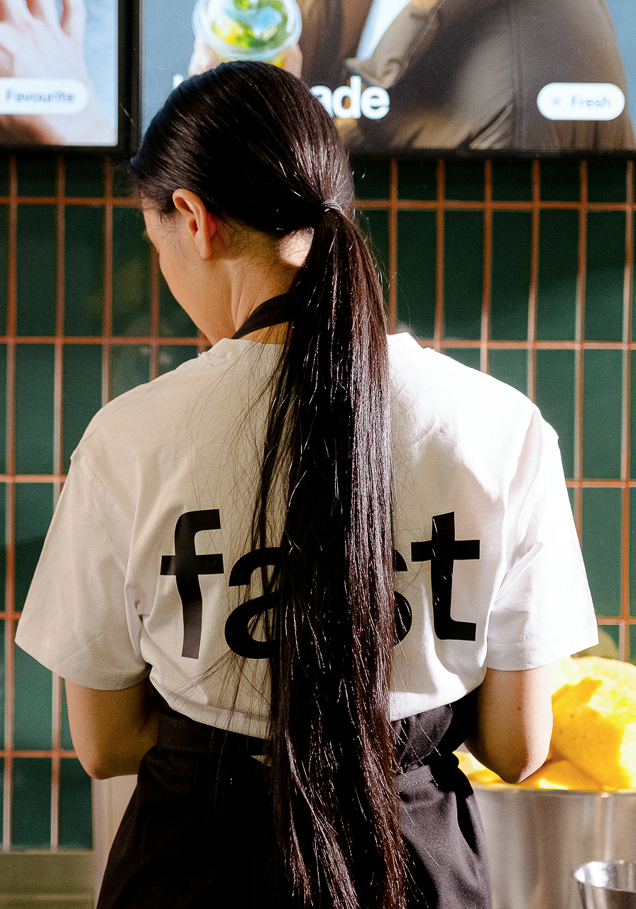
A clean, modern brand identity designed for speed, clarity and scale – with a playful edge rooted in everyday food culture.
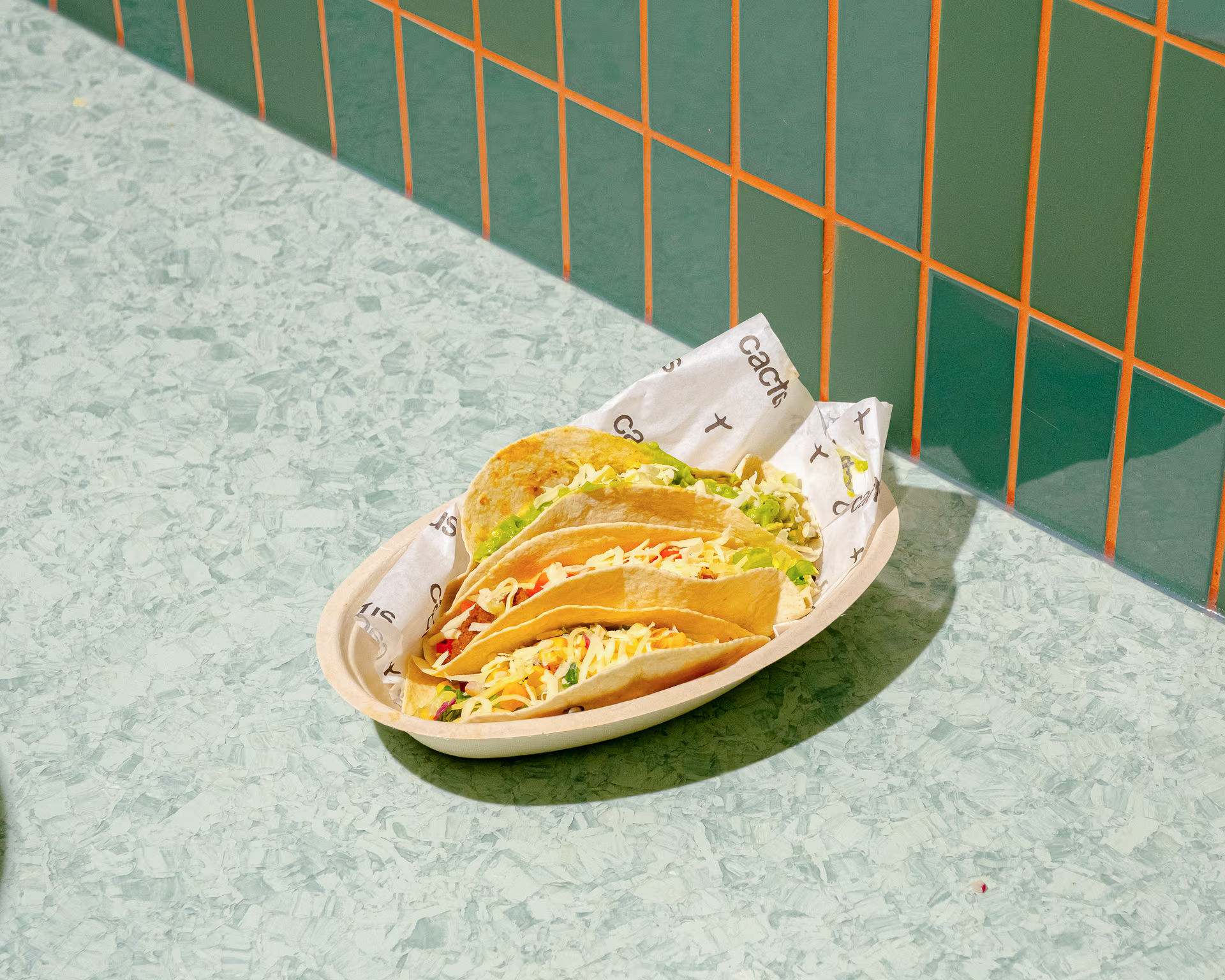
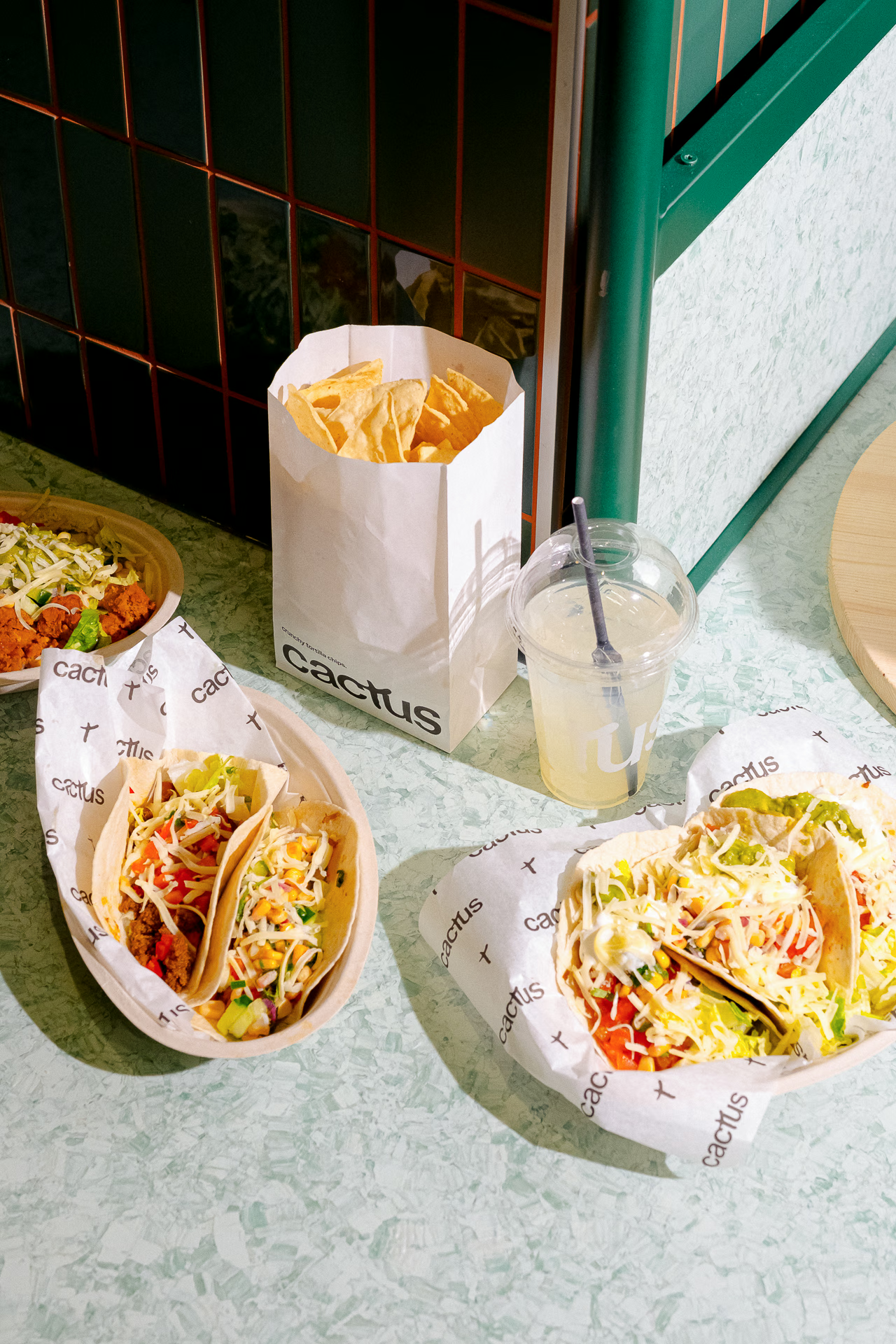
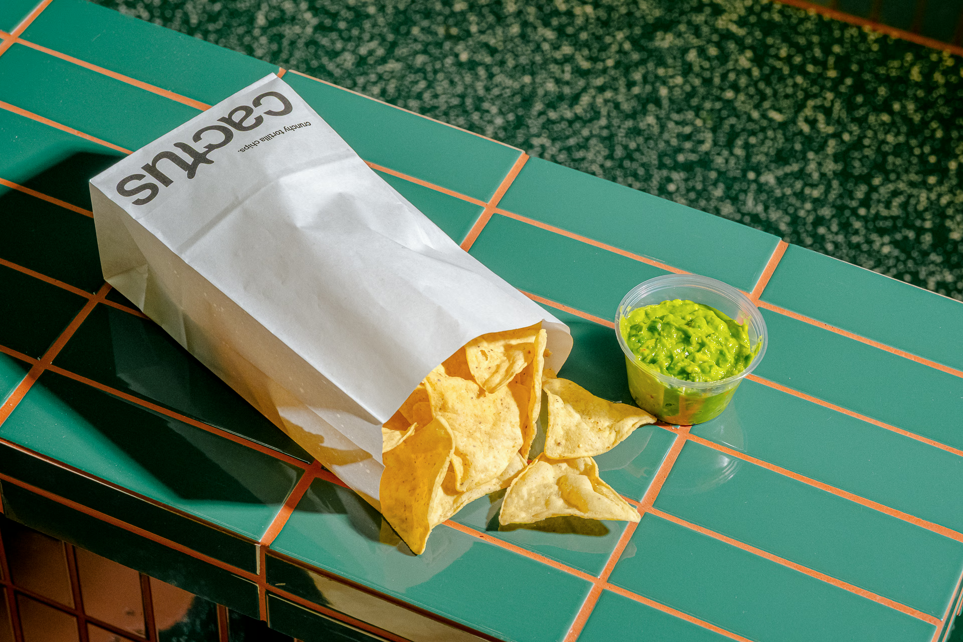
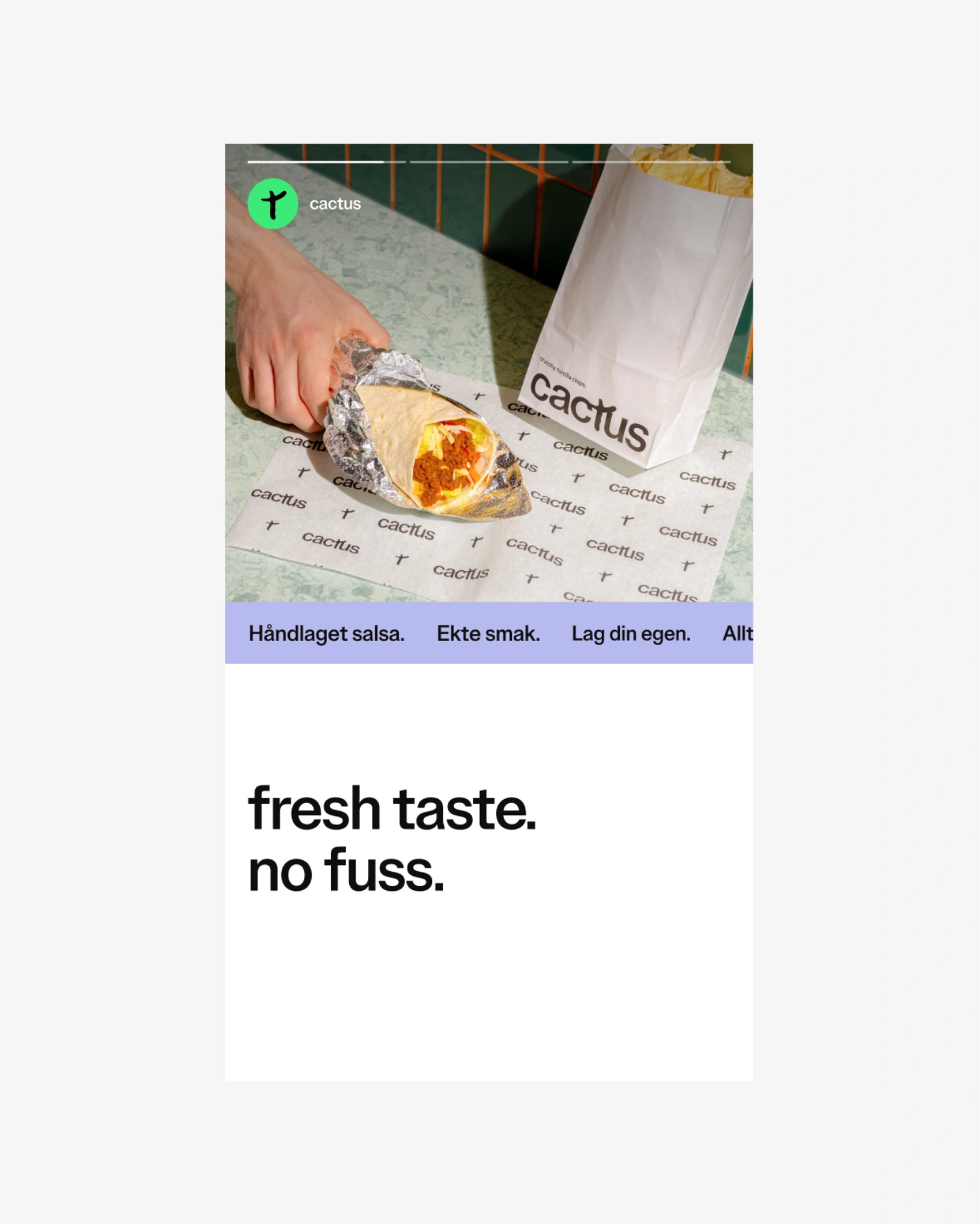
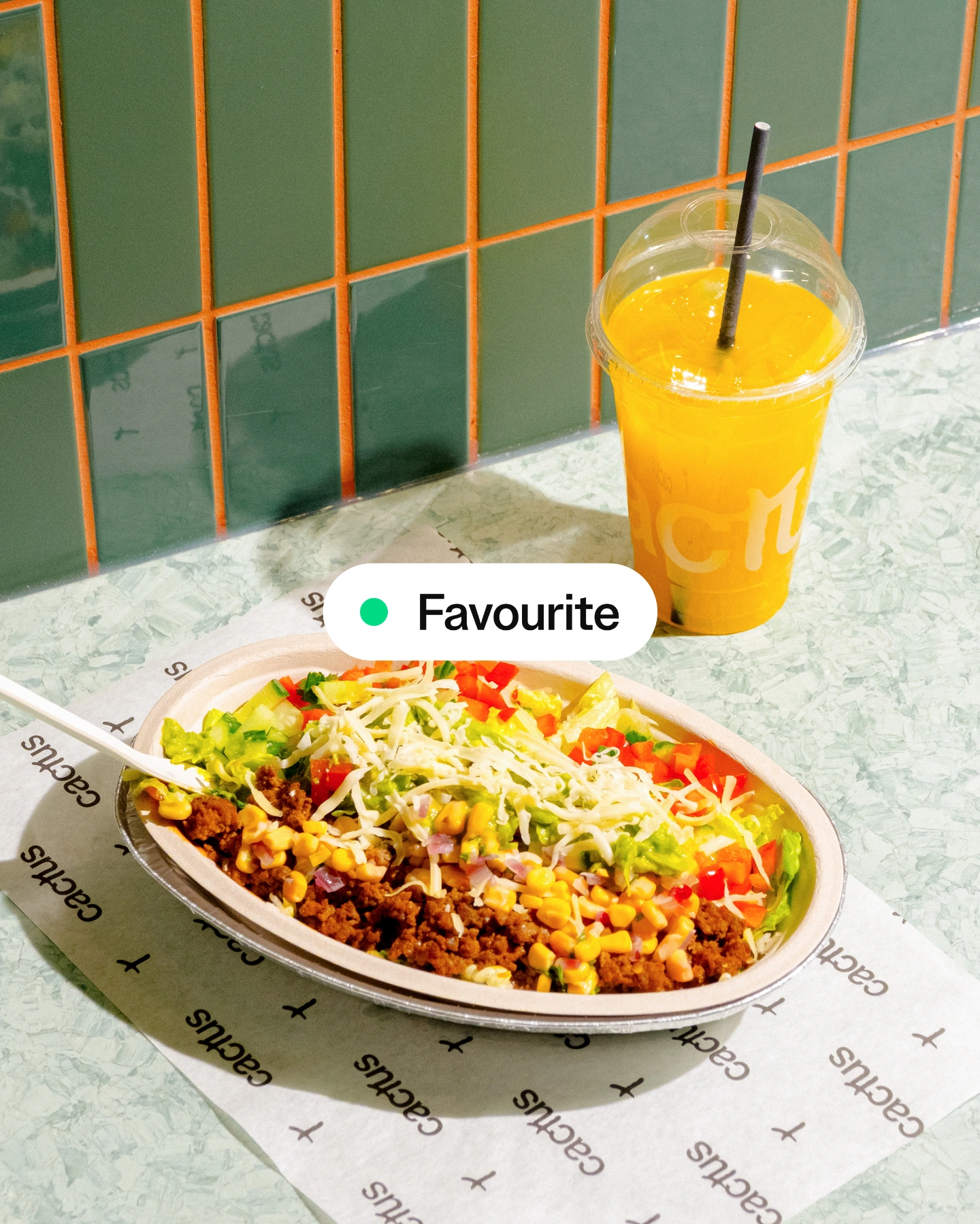
In Norway, tacos are part of the weekly routine – but not in a particularly Mexican way. Over time, a local taco tradition has taken shape, with its own set of preferences: a soft wheat tortilla filled with seasoned minced meat, grated cheese, chopped vegetables, and a generous spoon of rømme – the Norwegian version of sour cream. It’s a whole thing. Familiar, comforting, and very defined. The identity for Cactus embraces this local taco culture. It takes what’s already part of people’s habits and reframes it with clarity and intention – building something new within the fast food landscape. Not street food. Not traditional fast food. But something in between: fast, fresh and distinctly authentic.
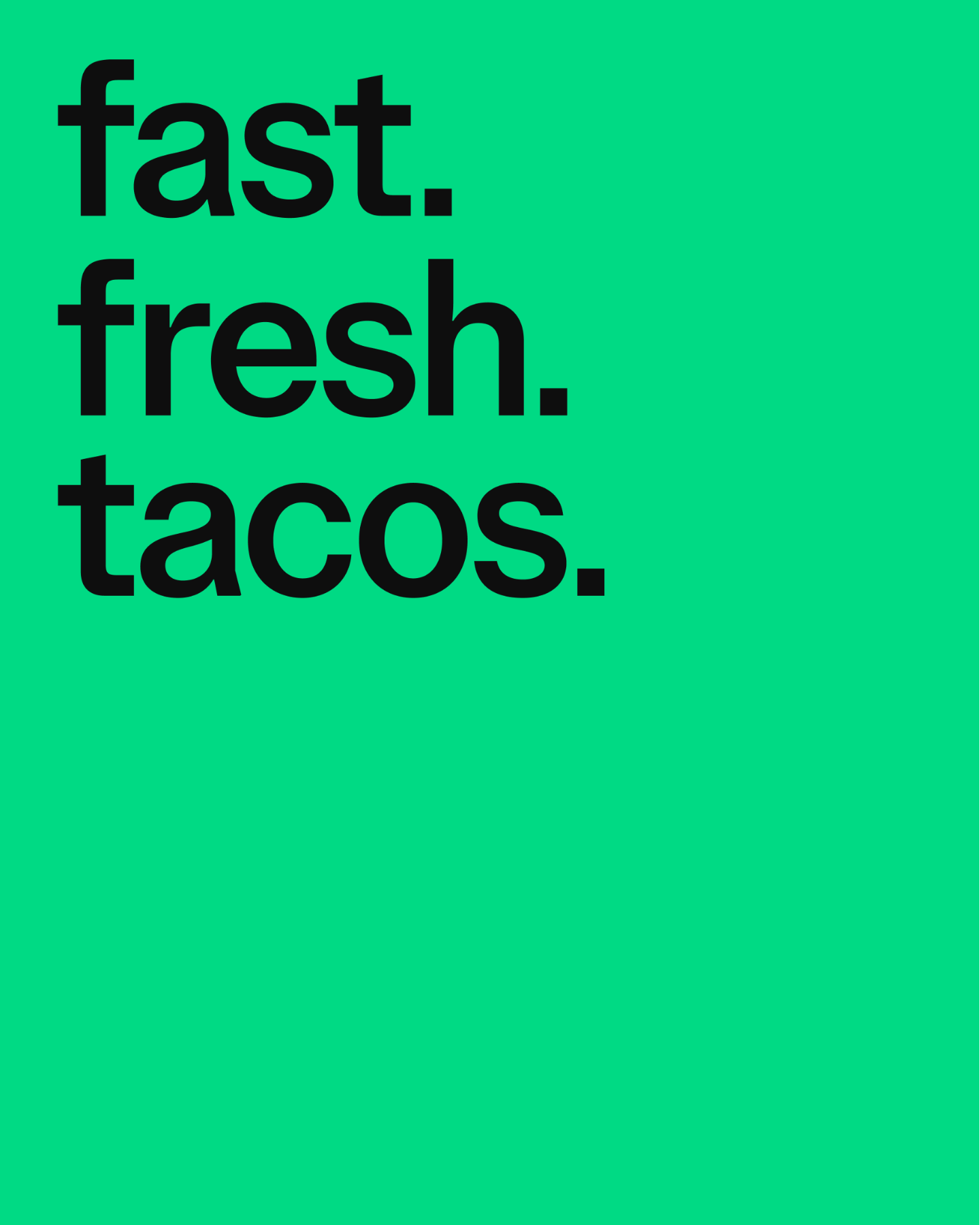
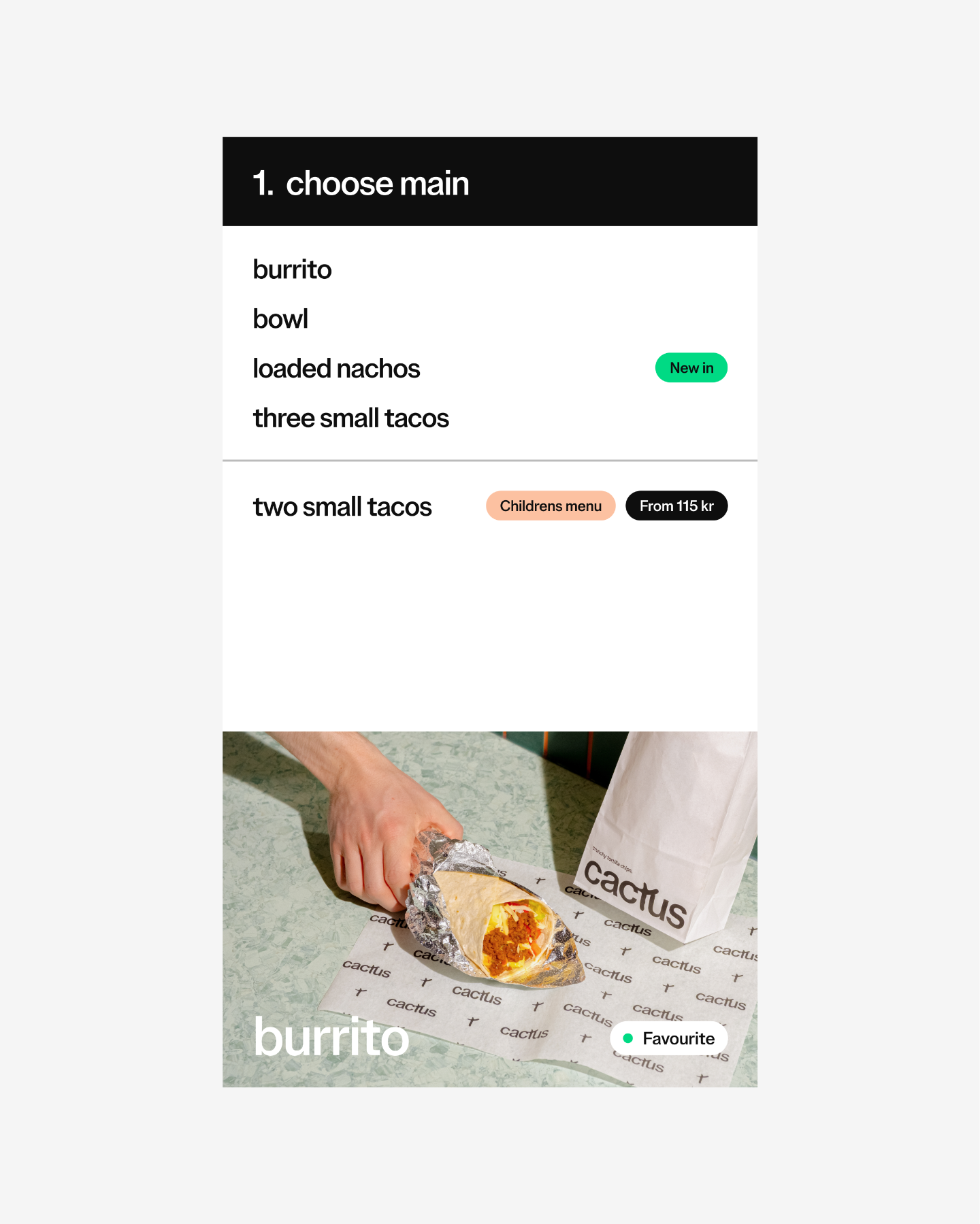
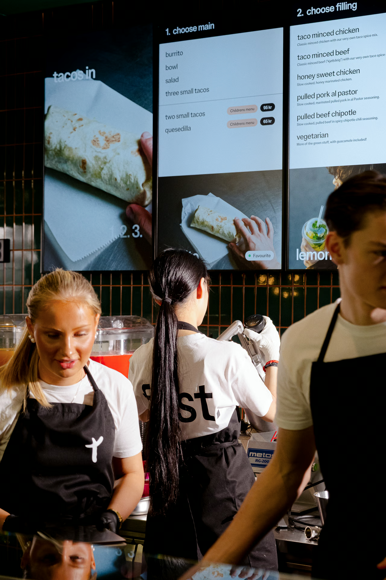
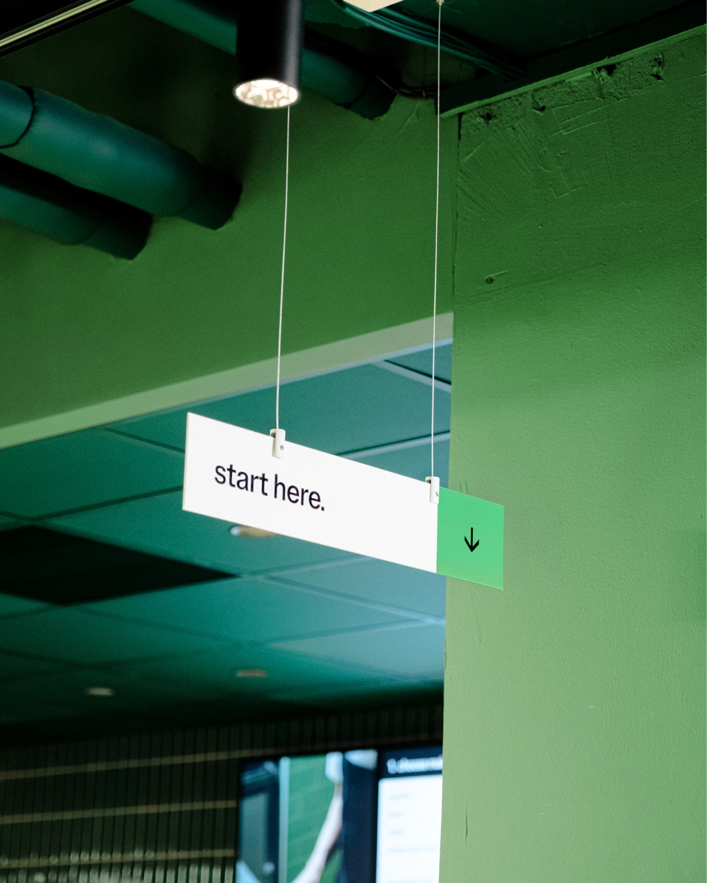
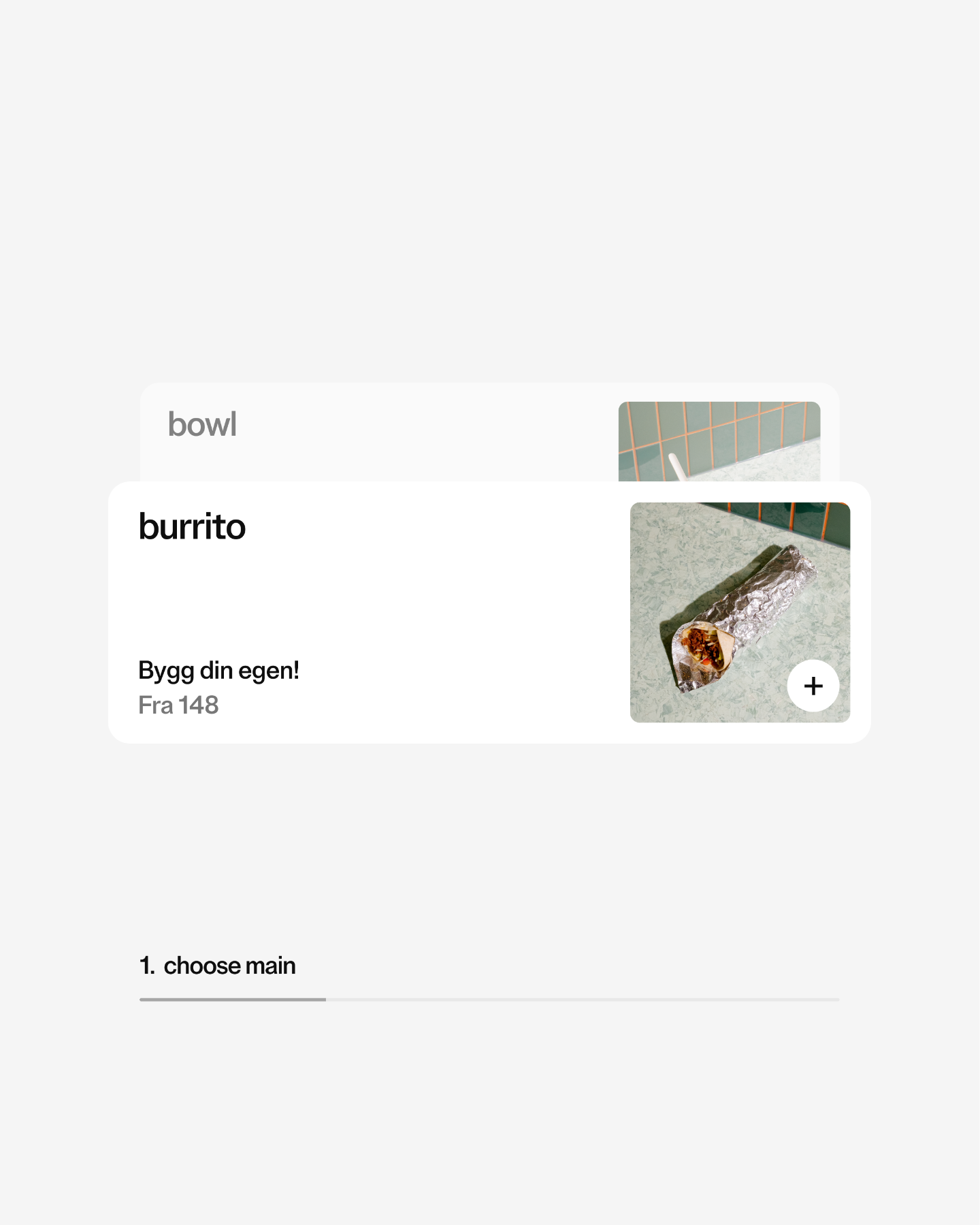
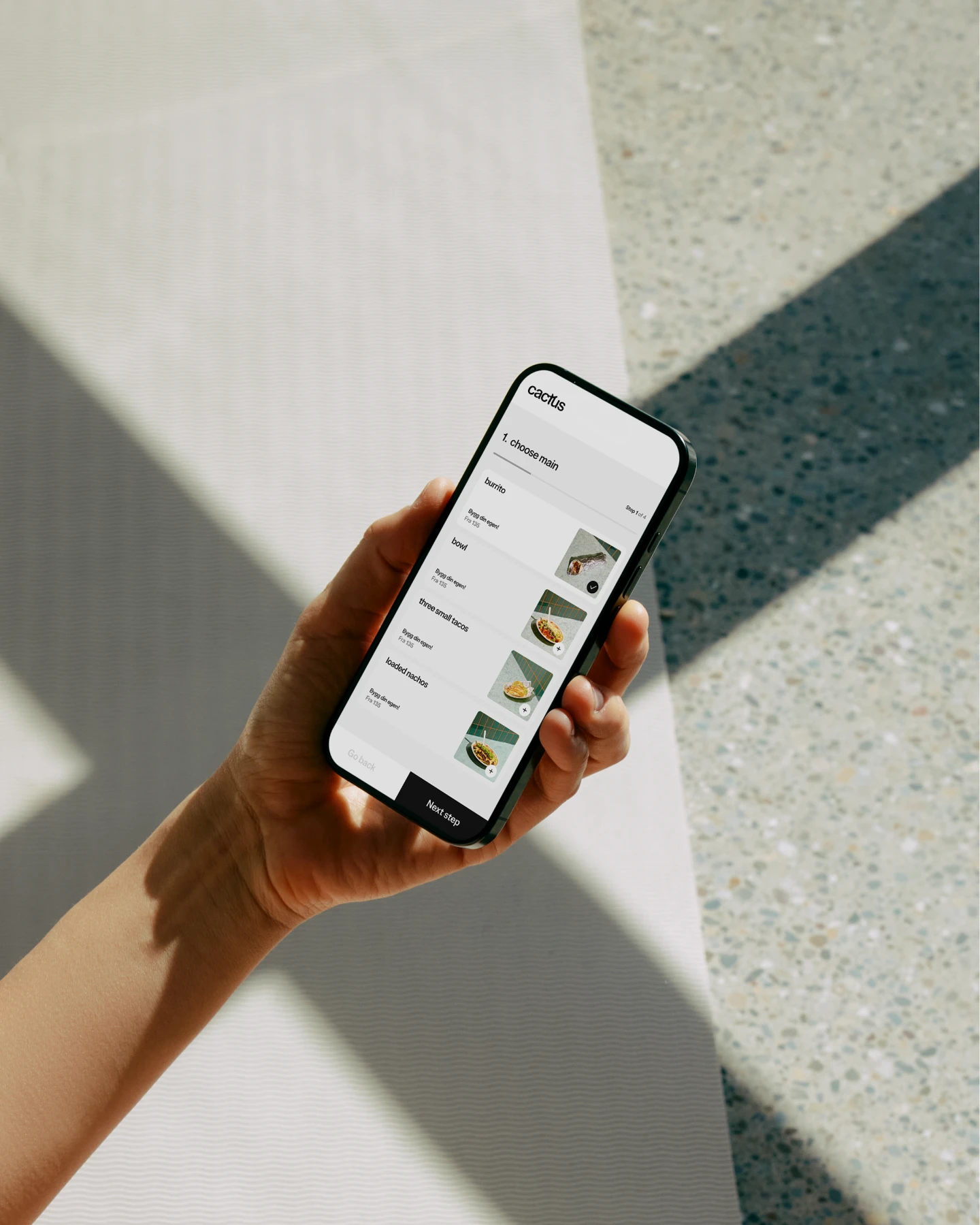
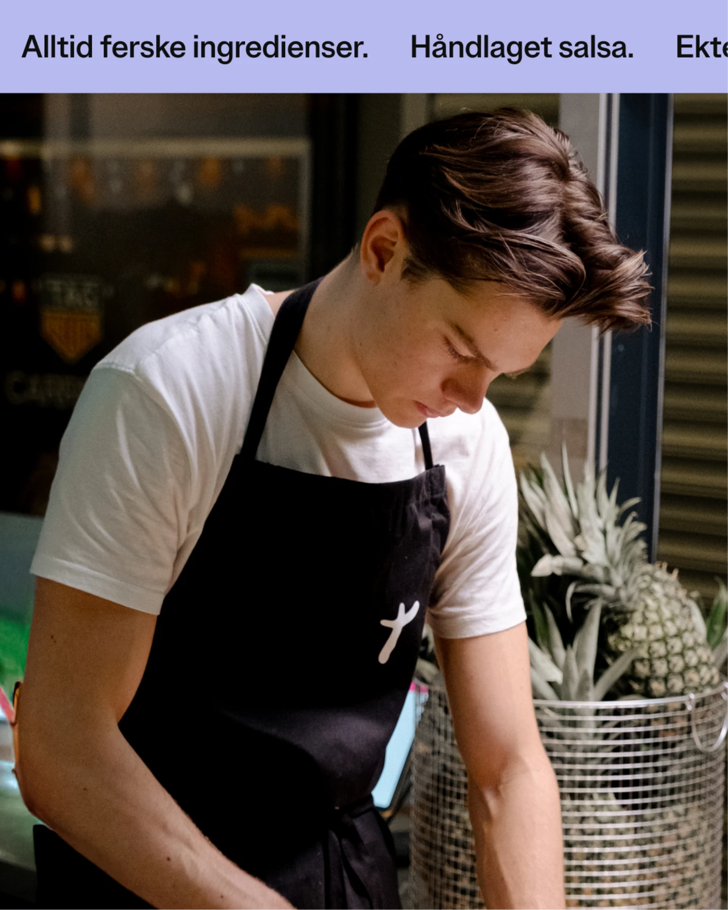
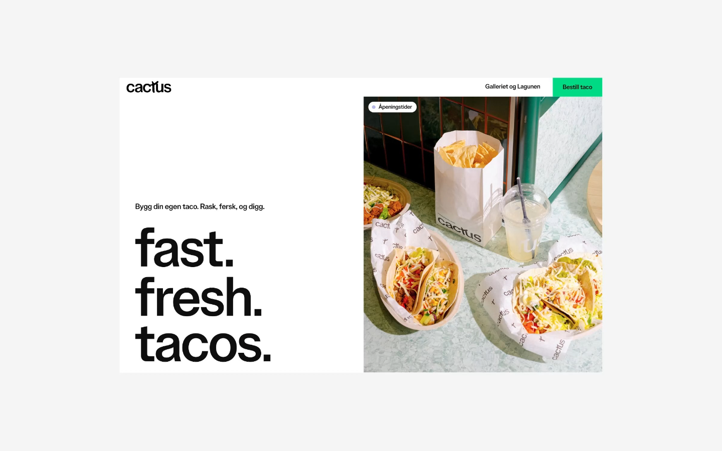
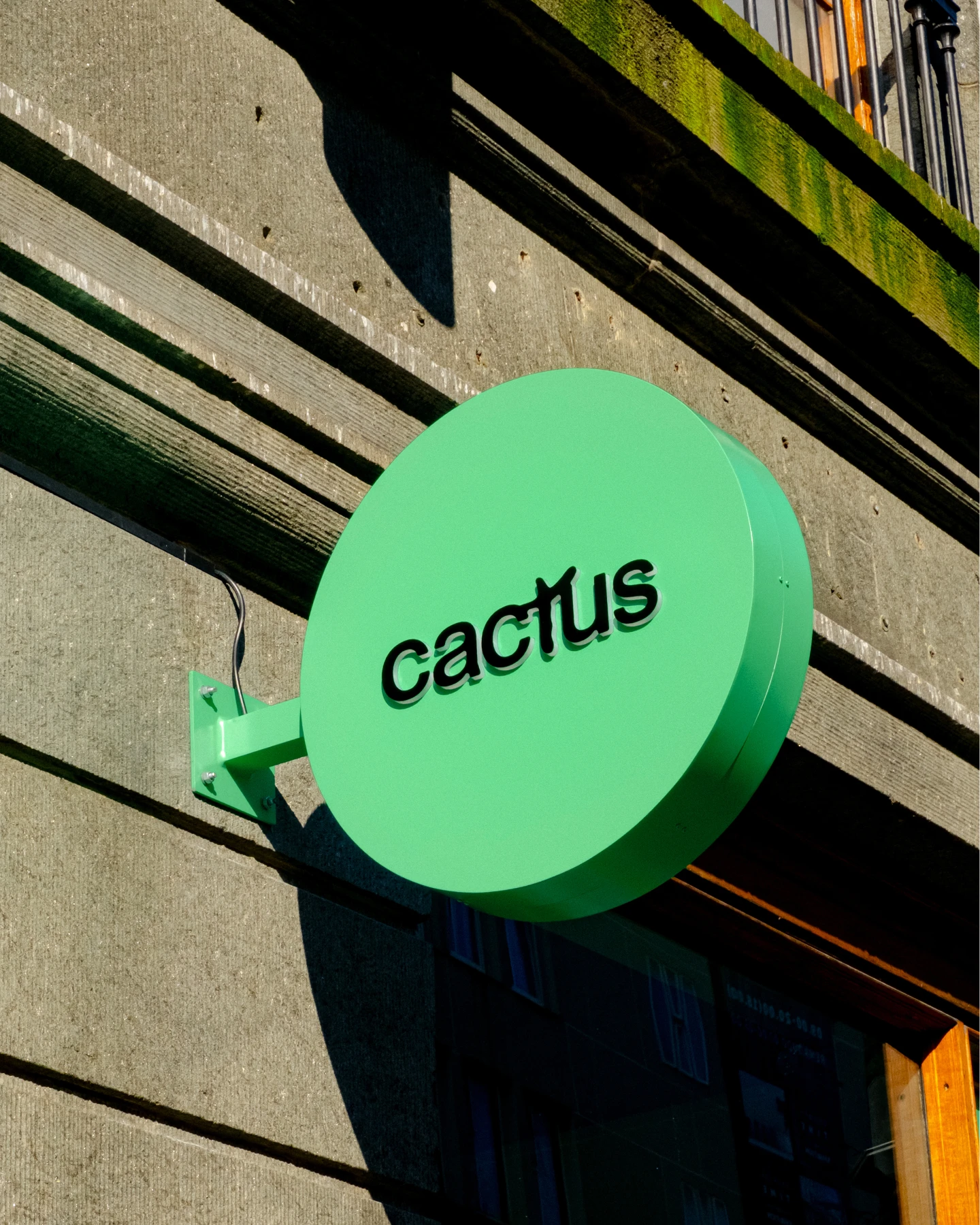
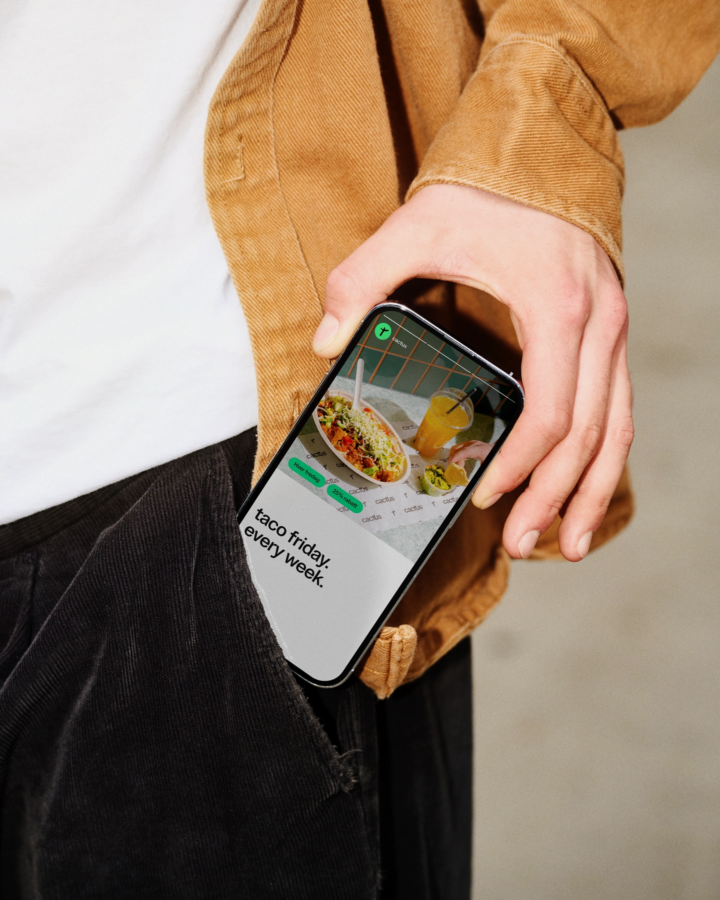
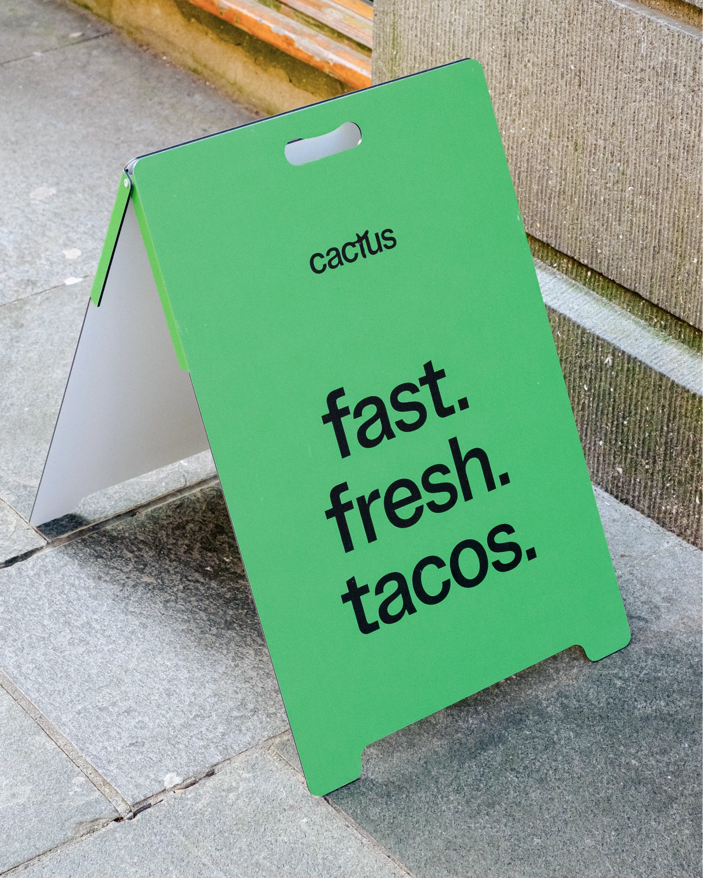
Cactus is built around three words: fast. fresh. tacos. The identity draws on Scandinavian design principles – clean, structured and airy. Typography is modern and confident, with enough character to carry both physical and digital applications. The color palette is calm and understated, complemented by vibrant accent tones inspired by fresh ingredients. A distinctive green plays a central role in the brand and is positioned as something Cactus aims to truly own within the fast food space. Layouts are built with clarity in mind, using space generously to give both text and imagery room to stand out. Combined with a tone of voice that’s direct, warm and practical, the result is a brand that feels modern, intentional and easy to connect with – across every touchpoint.
The first Cactus opened its doors in Bergen, March 2025. Demand exceeded all expectations – with long queues and multiple days of sold-out service in the opening weeks. The concept is growing. One taco at a time.