Website with Nordic edge and #nobullshit
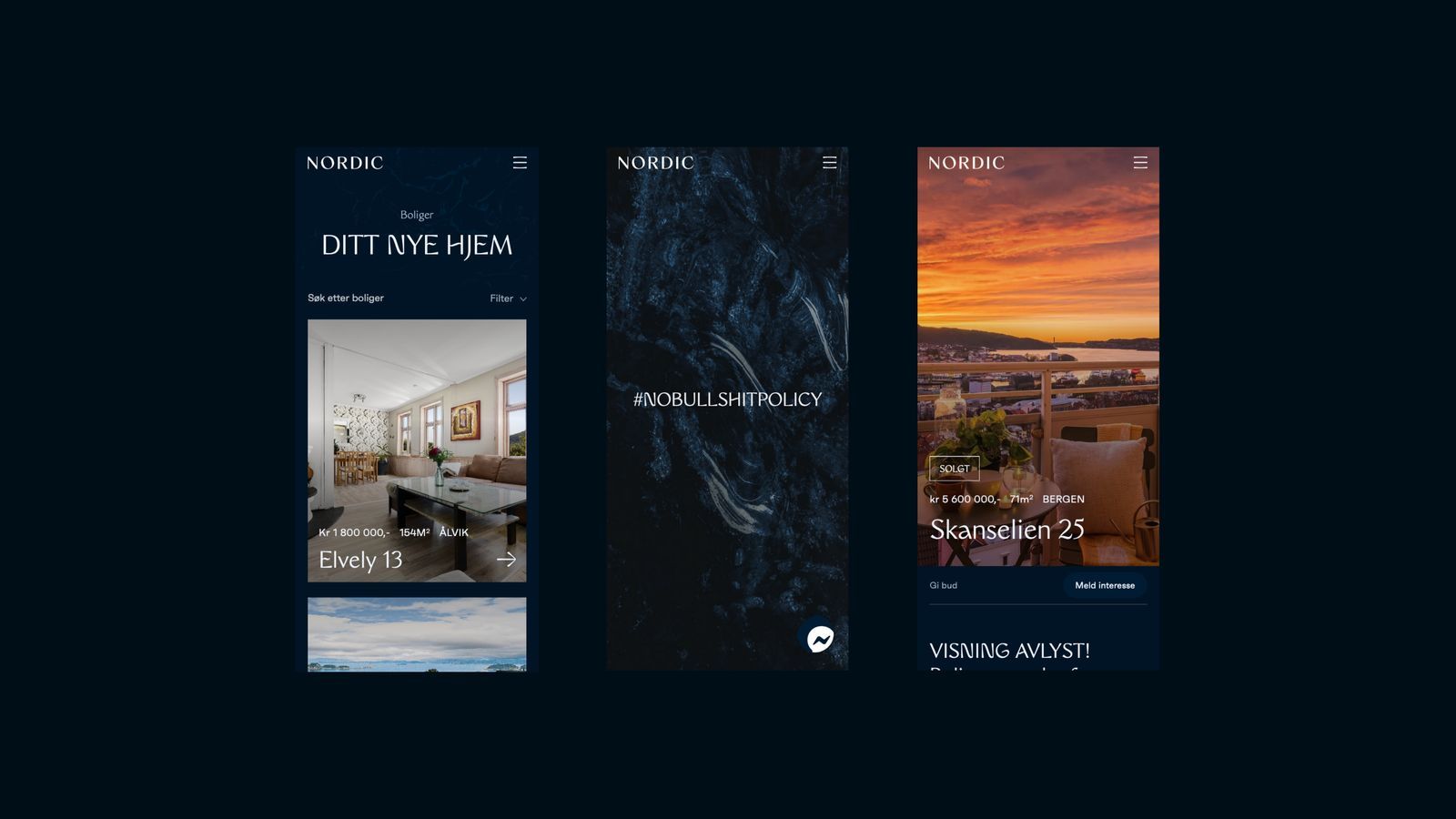
Nordic is a new contender in the real estate industry. The founders of Nordic have extensive experience in the industry and wanted to communicate this with a strong and credible visual identity. Nordic wanted to play on the Nordic, mysterious and exclusive. Although Nordic was newly established, they wanted an identity and website that radiated knowledge and that they had been in the “game” for many years.
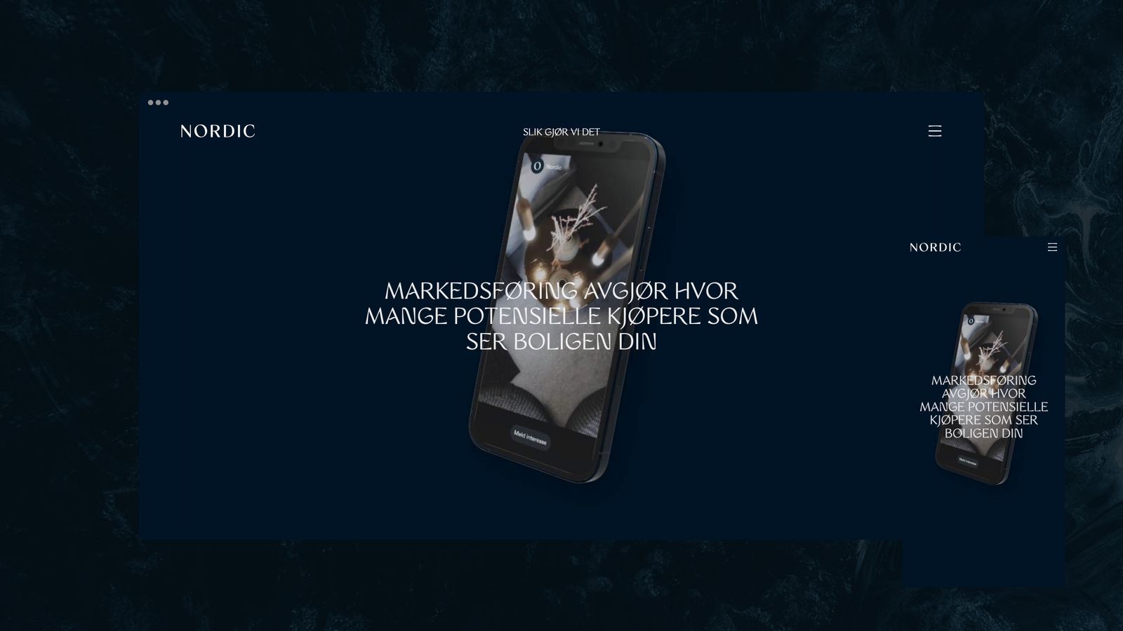
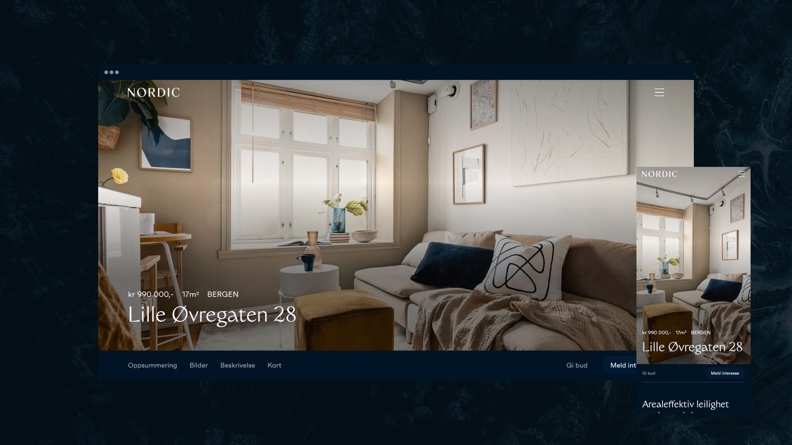
They wanted a website that stood out among the competition. We chose to create a front page that explains what Nordic stands for in a new and creative way. It describes what Nordic delivers and what the customer can expect - #nobullshit. The undersides are in a style that portrays the dwellings in a good and welcoming way. The website should also have necessary integrations against, among other things, the brokerage system Vitec.